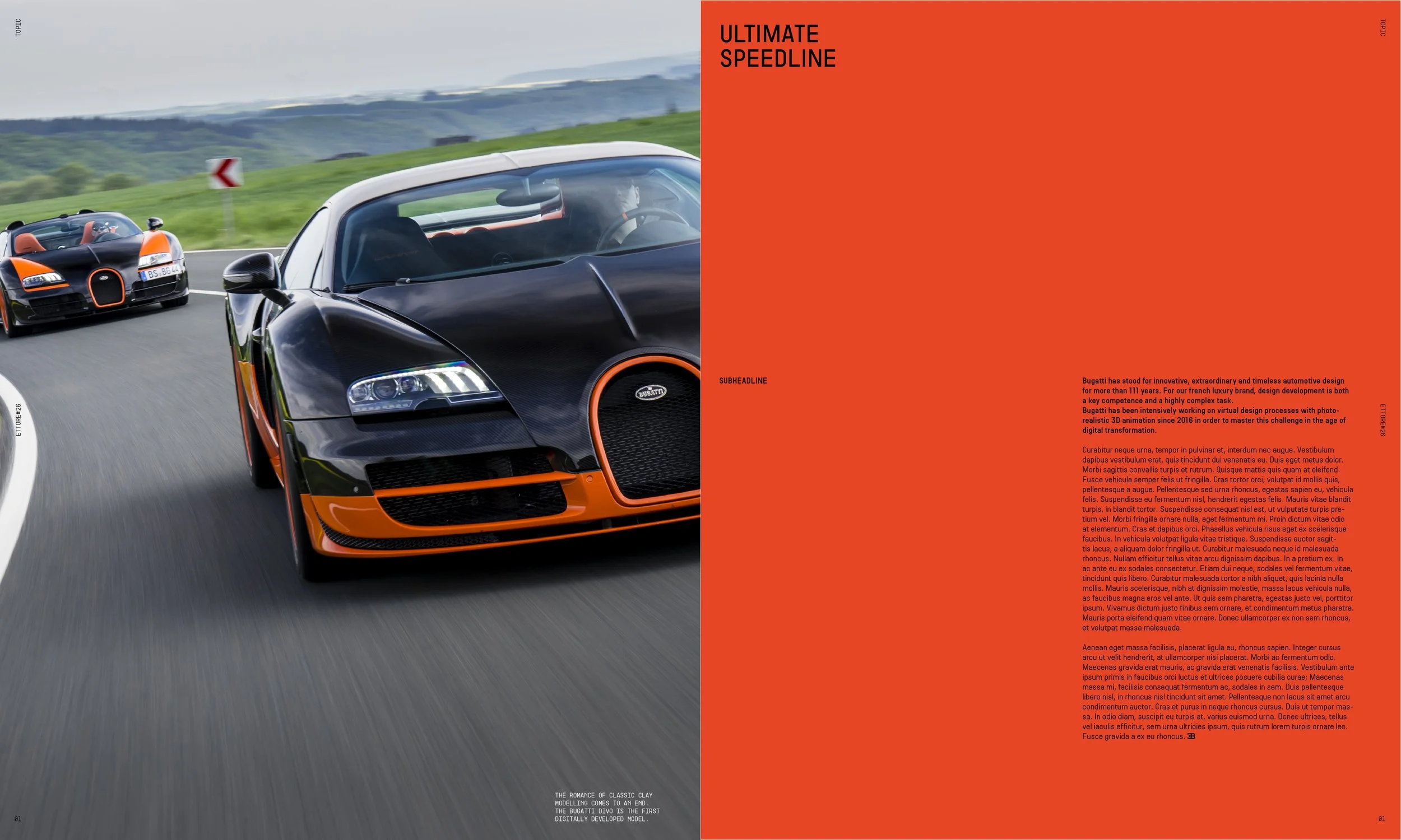
Bugatti has never been a brand that plays it safe. When Interbrand reimagined their visual identity — bold, daring, uncompromising — the challenge was to take that new aesthetic language and bring it to life on the page.
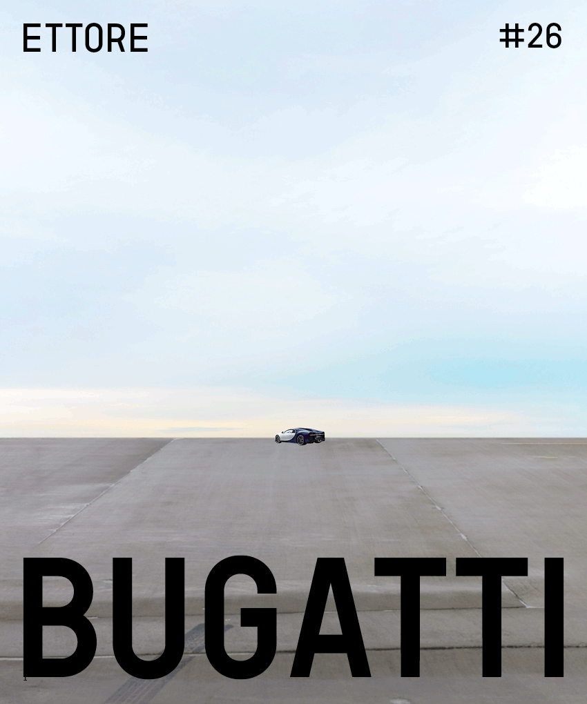
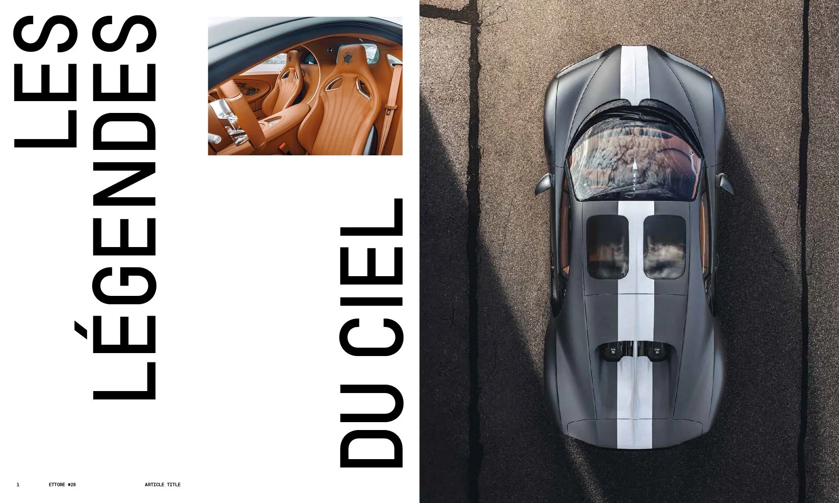
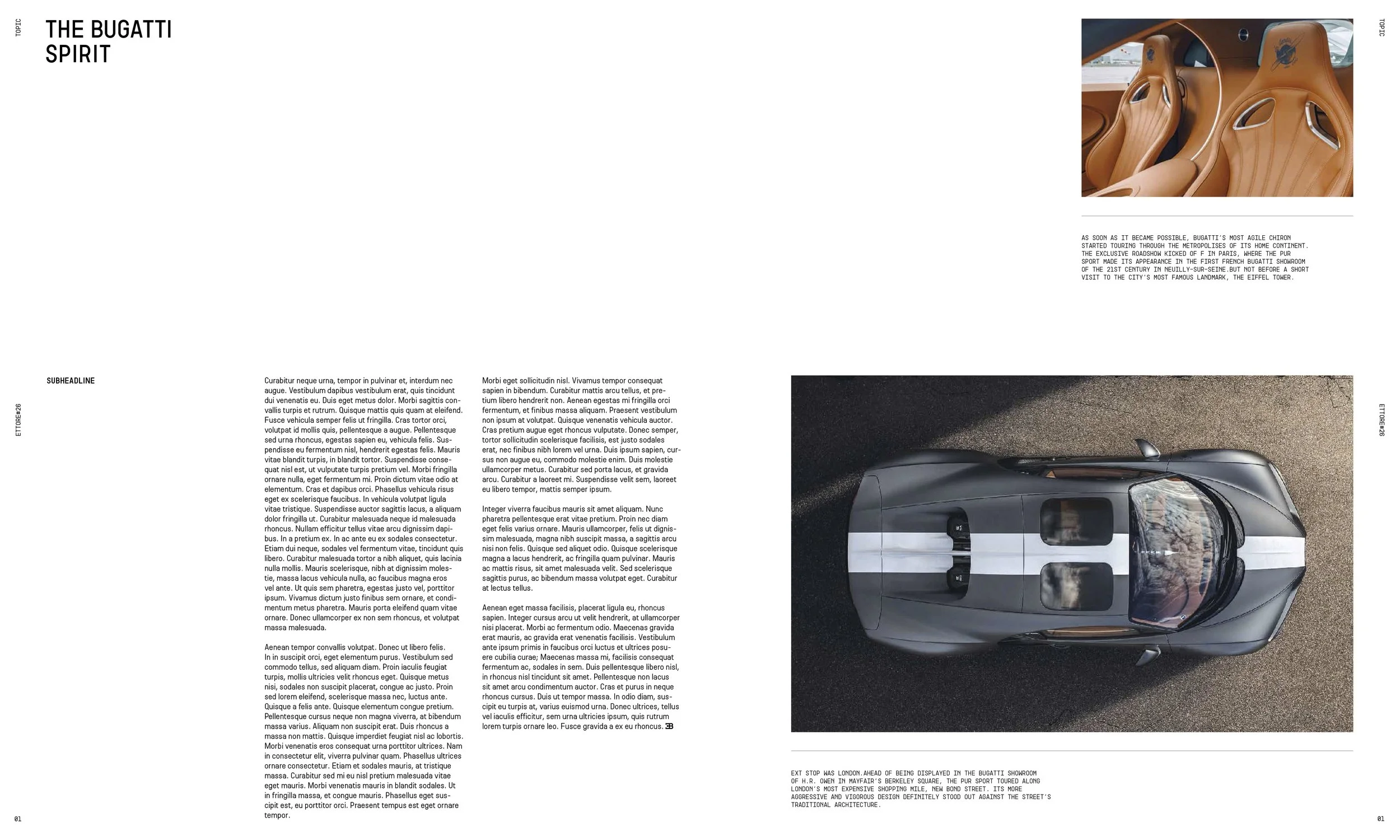
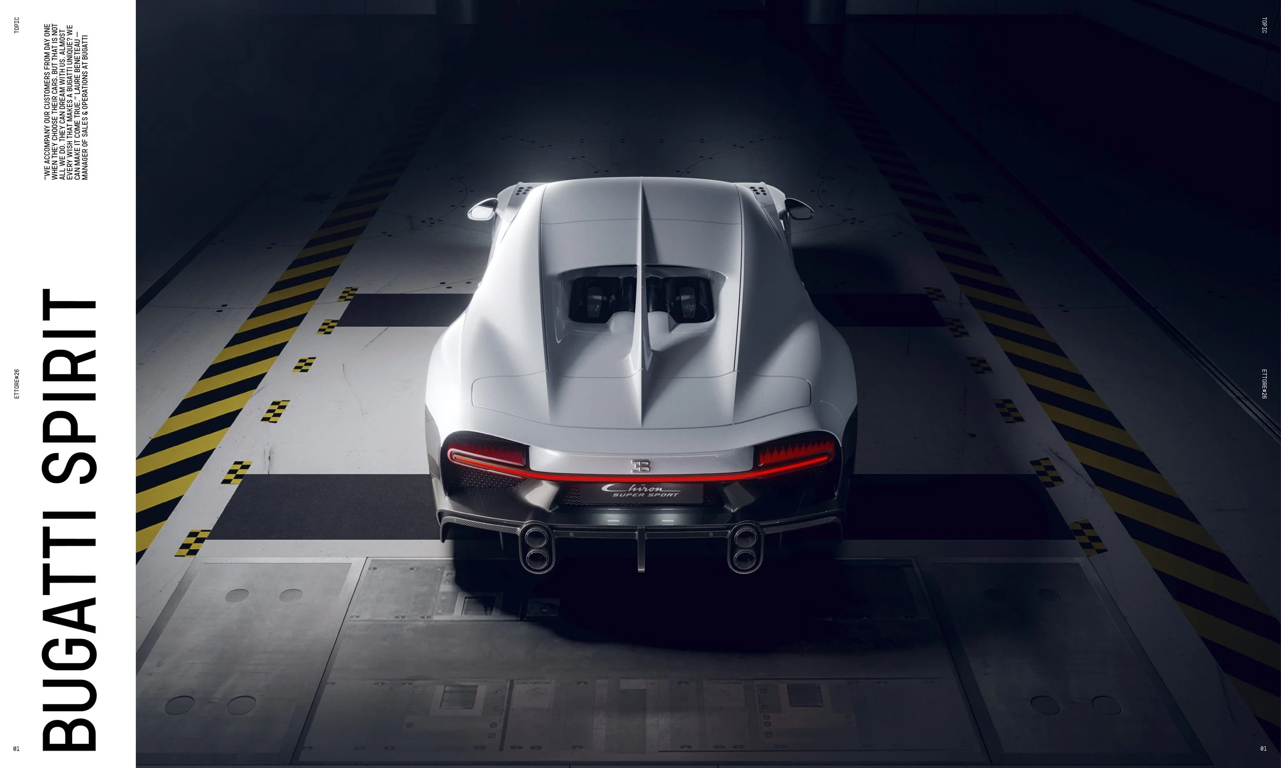
Commissioned to explore editorial layouts for Ettore, Bugatti’s flagship magazine, I developed cover and layout concepts each exploring the same central tension — typography and imagery in dialogue. Scale, hierarchy, contrast. How far could the brand be pushed before it stopped feeling like Bugatti, and how much boldness was needed before it truly did.
Each variation approached information hierarchy differently — some led by image, some by type, some by the charged space between them. Together they form a system of possibilities, a visual language with range.