Busch-Jaeger Rebranding
with Sooii GmbH
Busch-Jaeger had been evolving for years — gradually becoming bolder, more confident. But their visual language remained rooted in technical rigidity. The next step was a more fundamental shift — toward warmth, humanity, and a brand that felt as considered as the products it represented.
Working in close collaboration with Sooii Agency, I contributed to a full brand refresh as Art Director — spanning logo refinement, colour system, social media style, and image direction.
The central challenge was finding the balance. Introducing organic shapes, warm gradients, and a new image language without losing the technical precision that defines Busch-Jaeger at its core. A brand that could feel human without forgetting what it is.
The result is a visual identity with range — warm enough to connect, rigorous enough to convince.


Visual Style

Organic shapes:
Photography
Organic shapes:
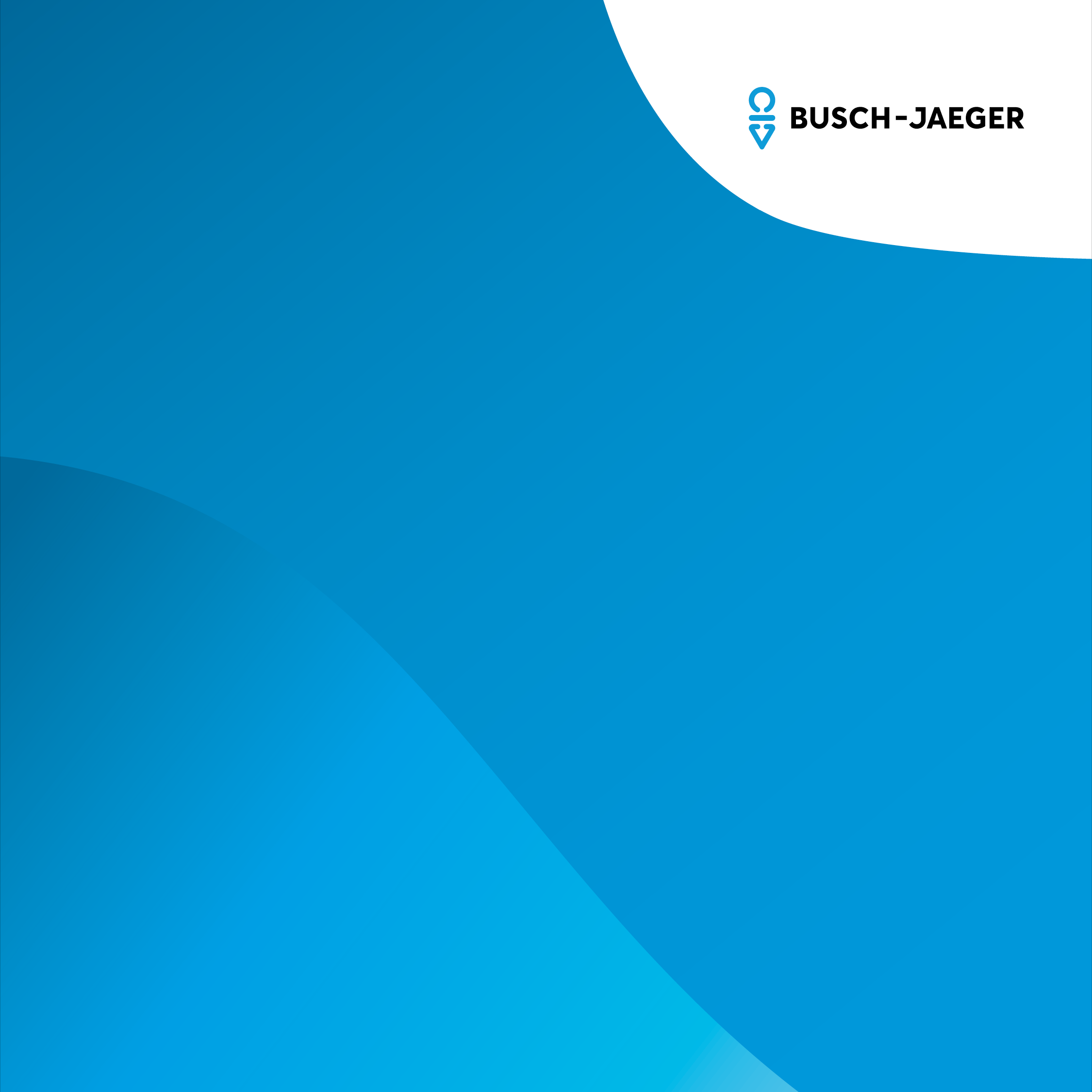
Layout and Logo
Organic shapes:
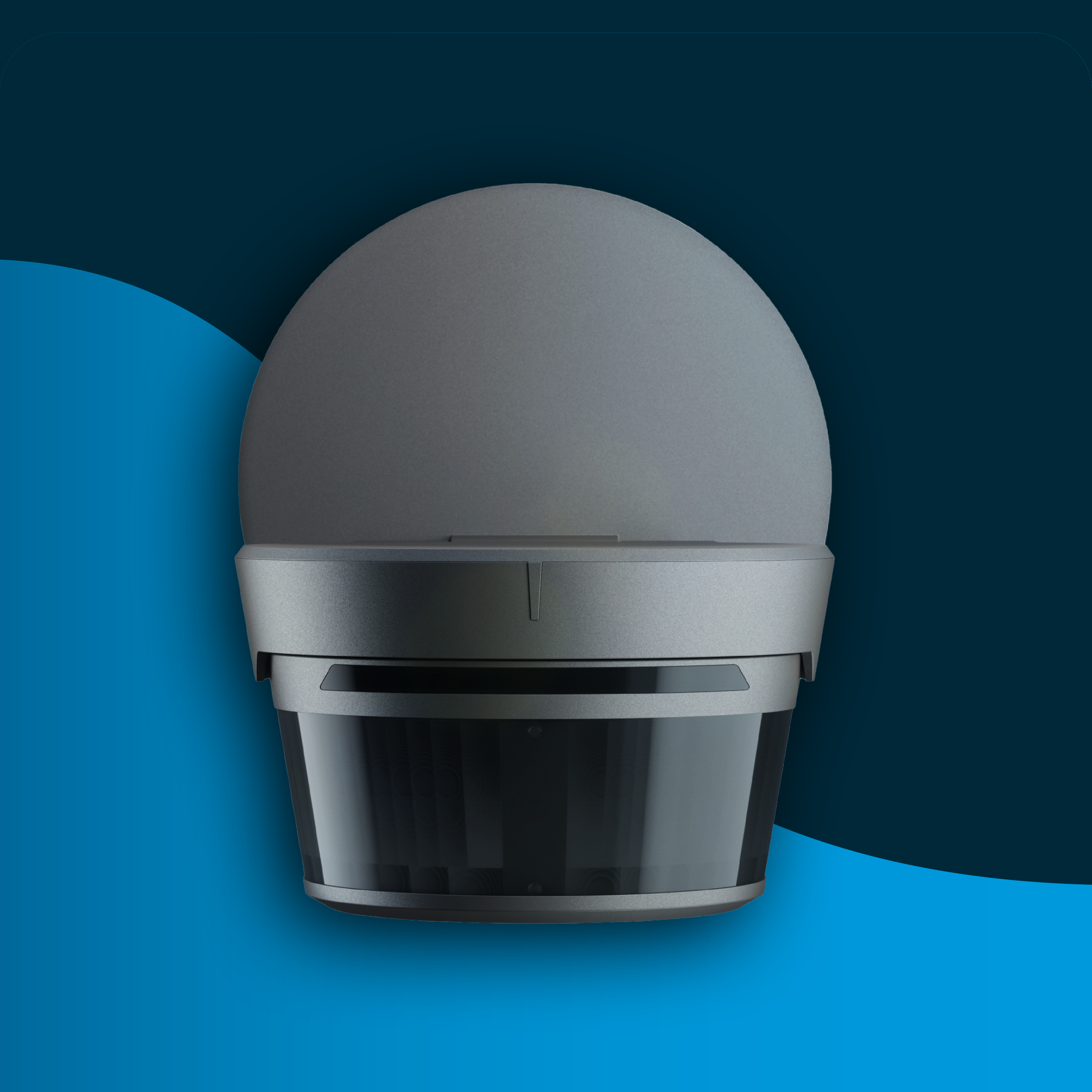
Product

Rounded corners:
Photography
Rounded corners:
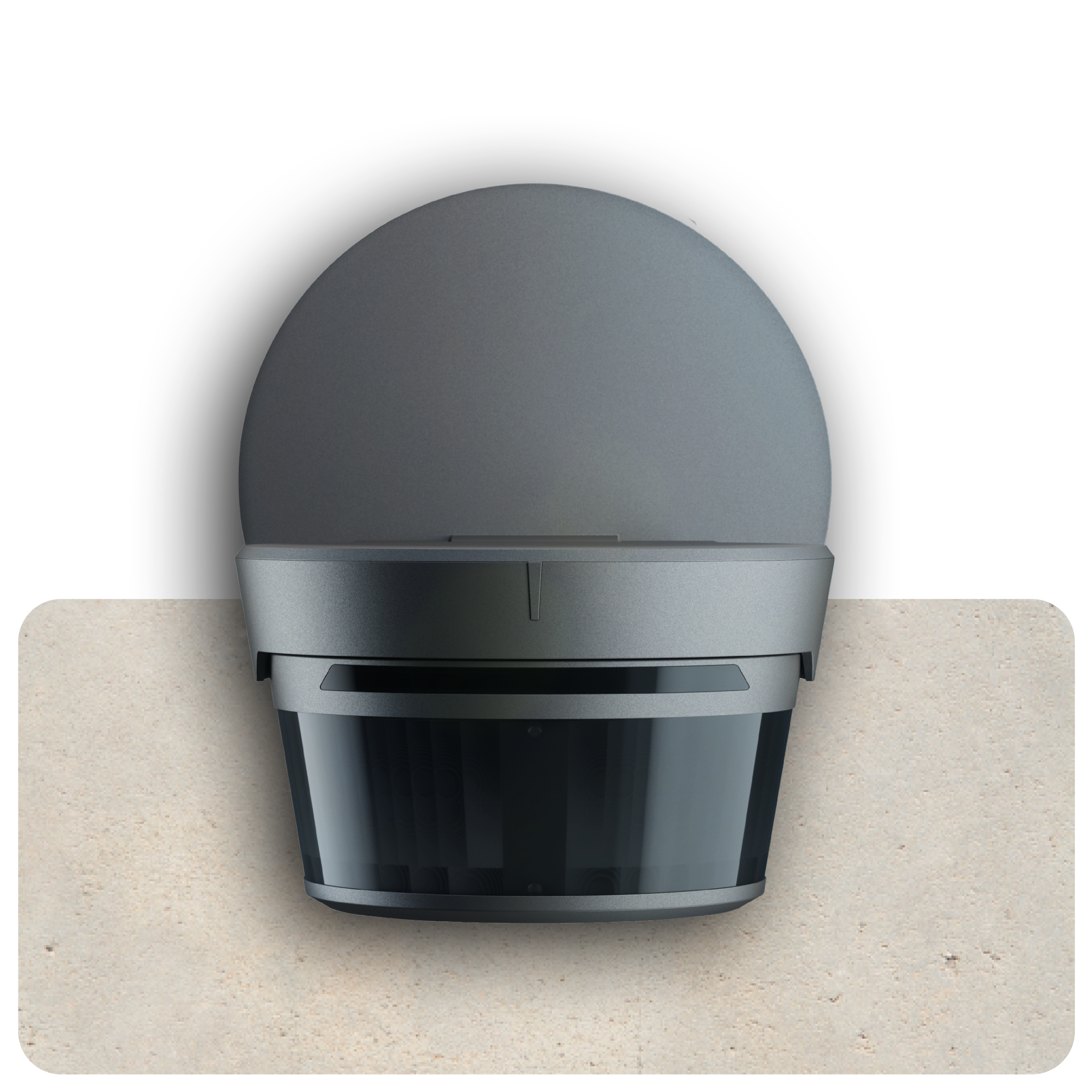
Product
Rounded corners:
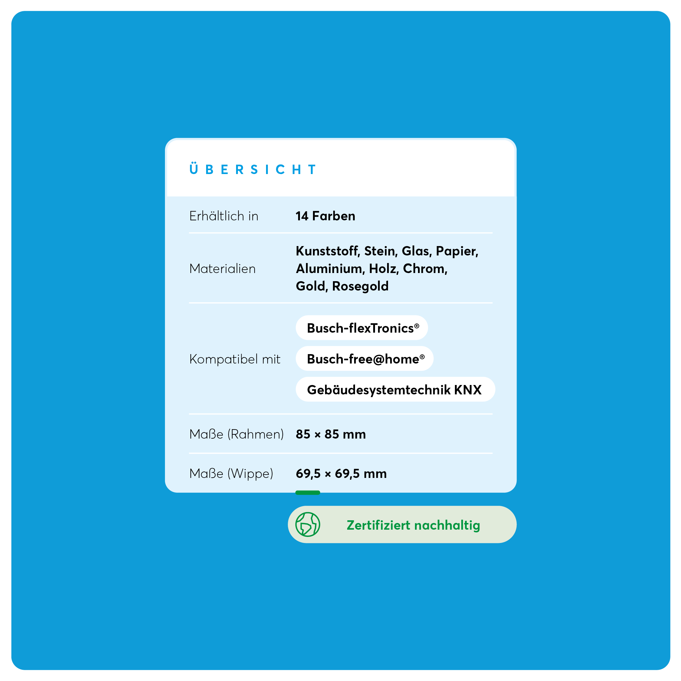
Layout and Typography
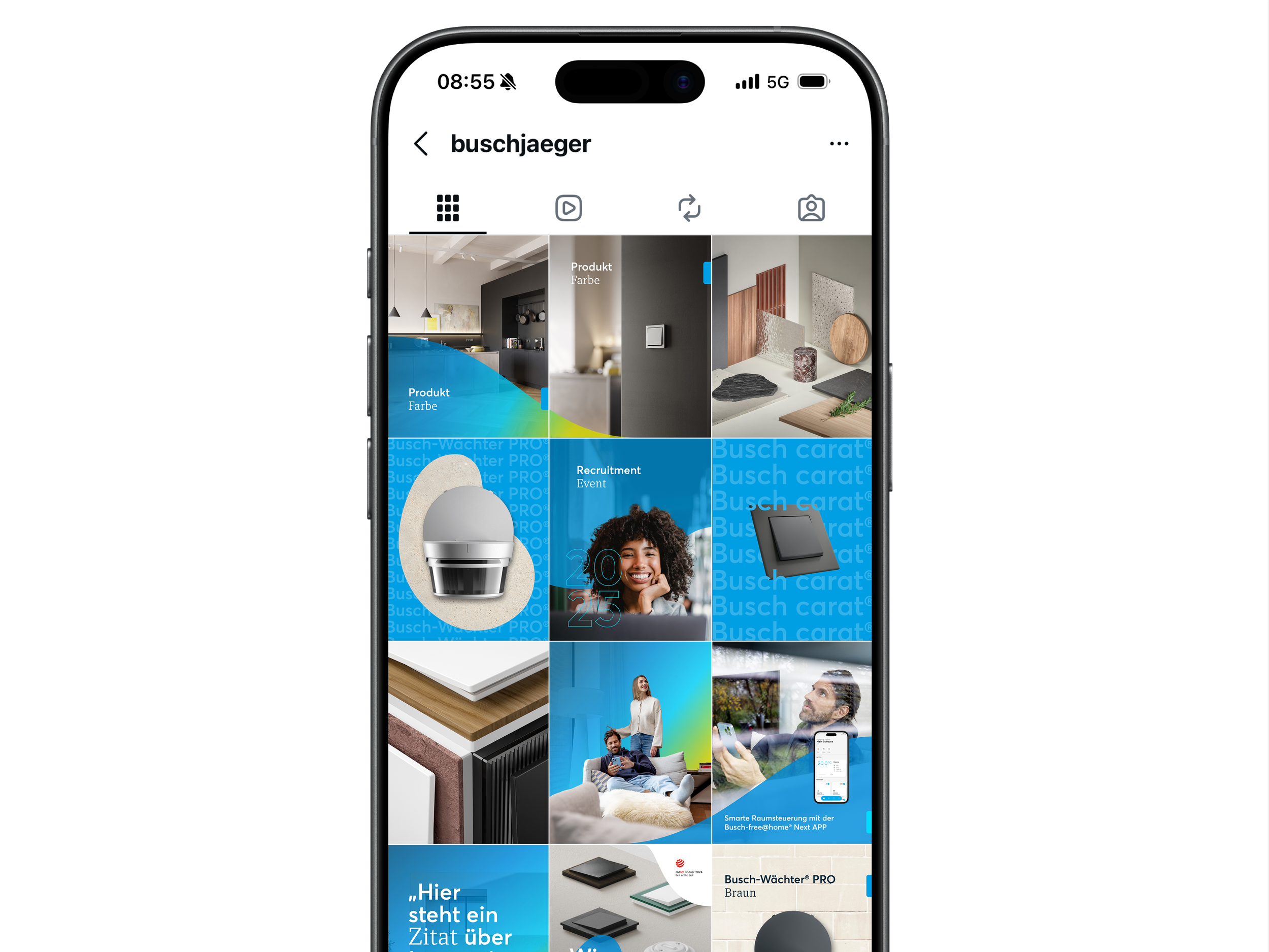
Social Media: Look and Feel

Social Media: Templates
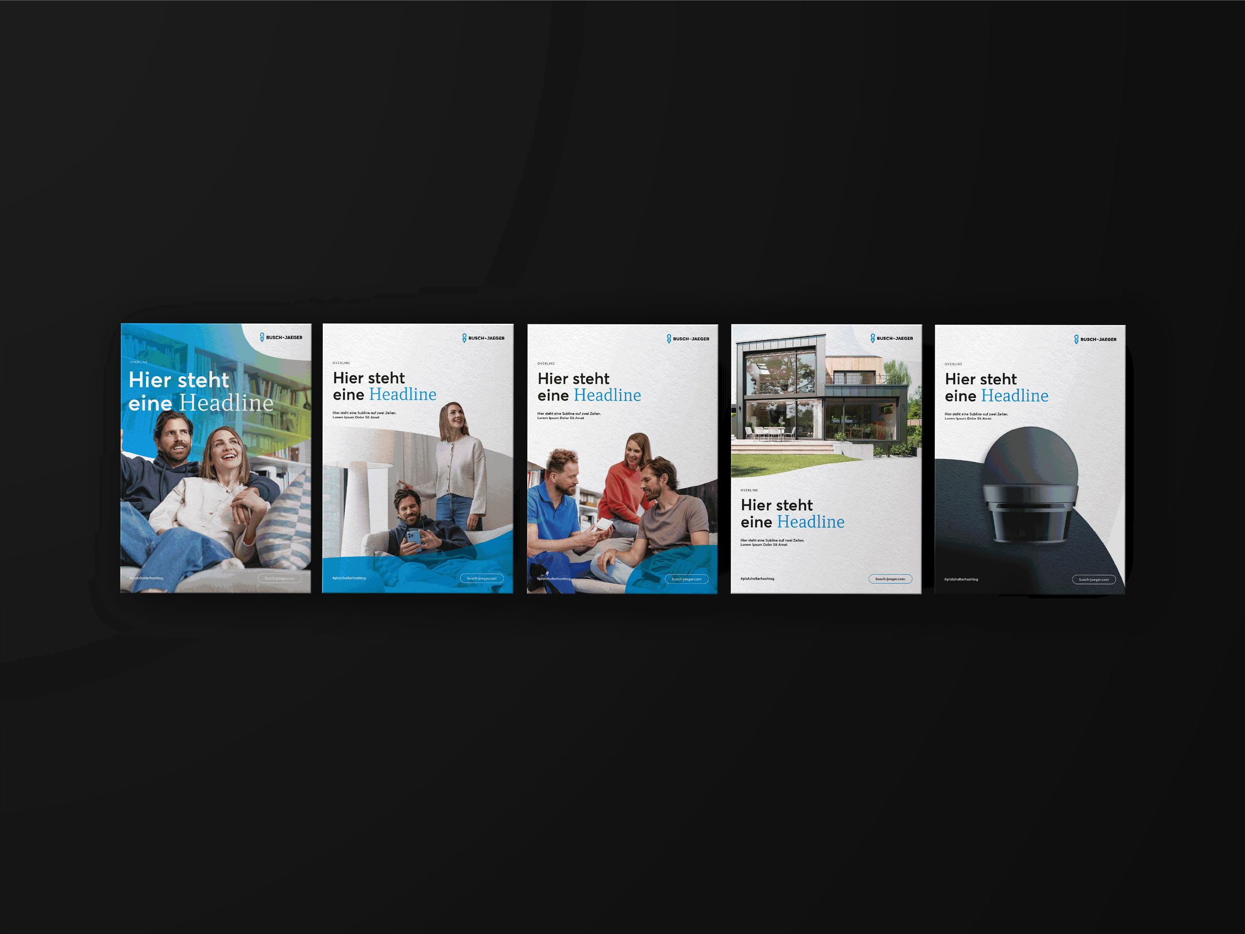
Brochure: Cover series templates
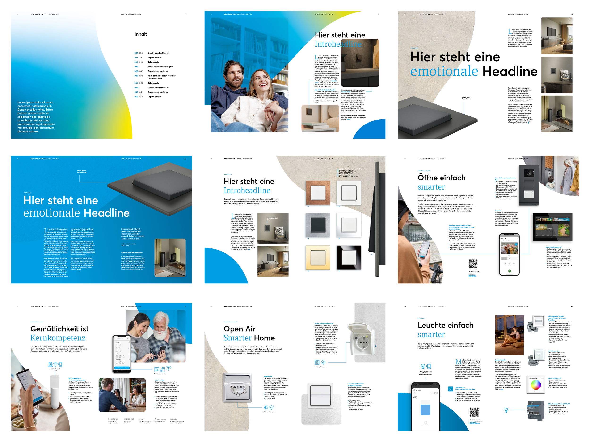
Brochure: Layout templates